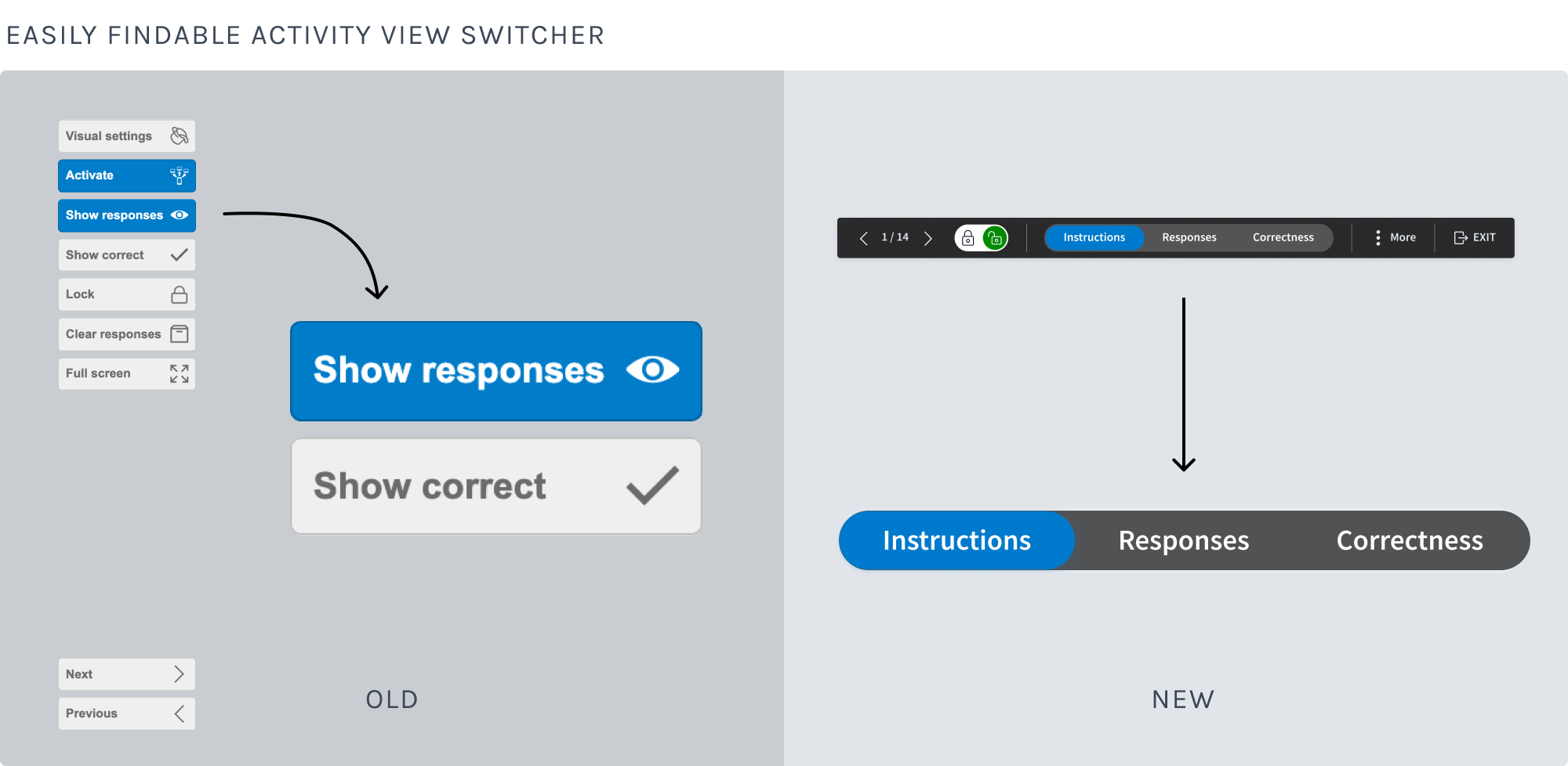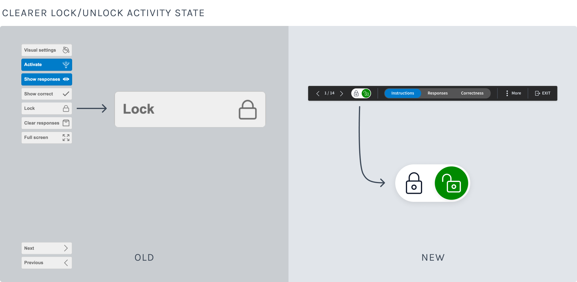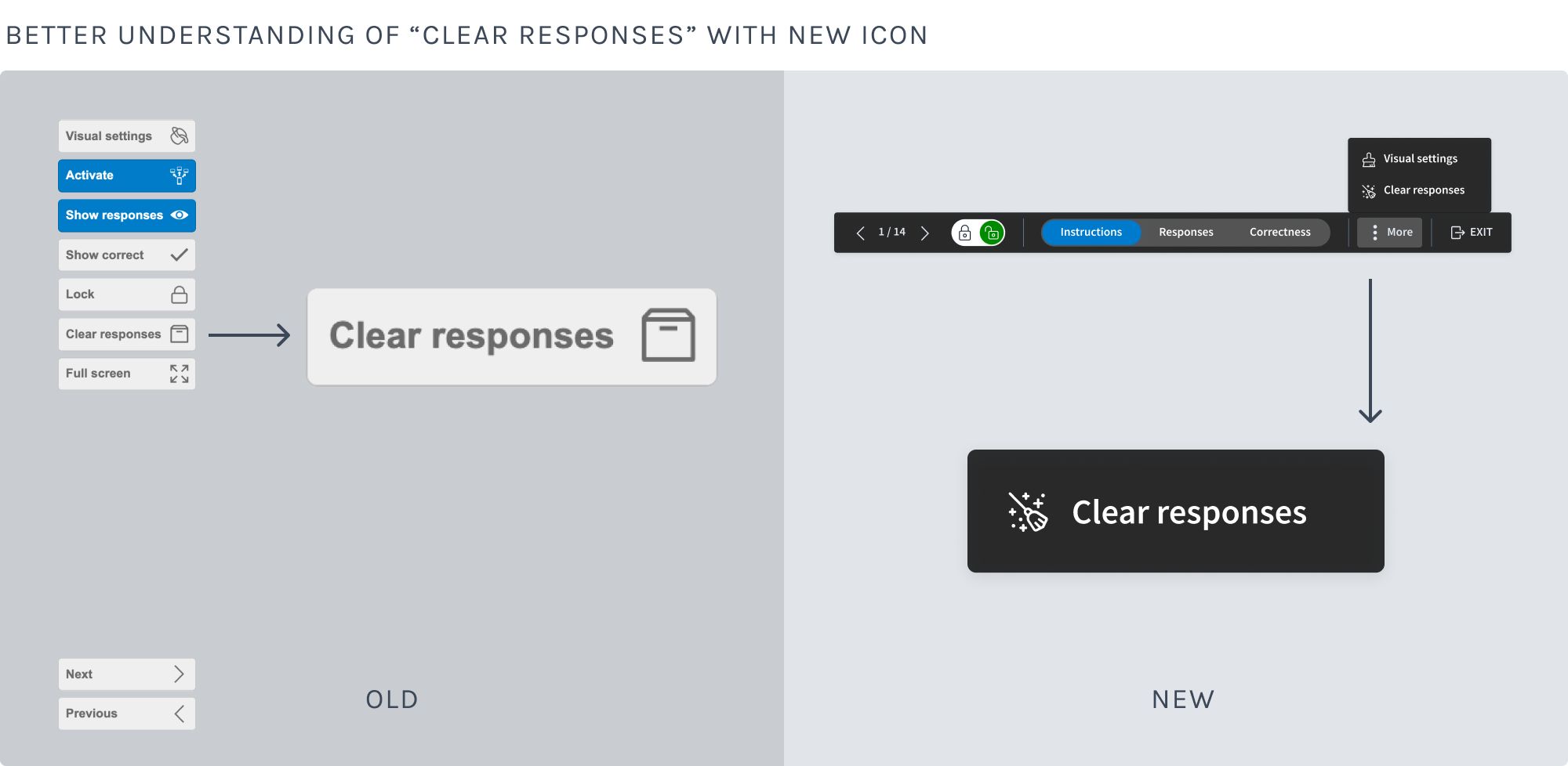
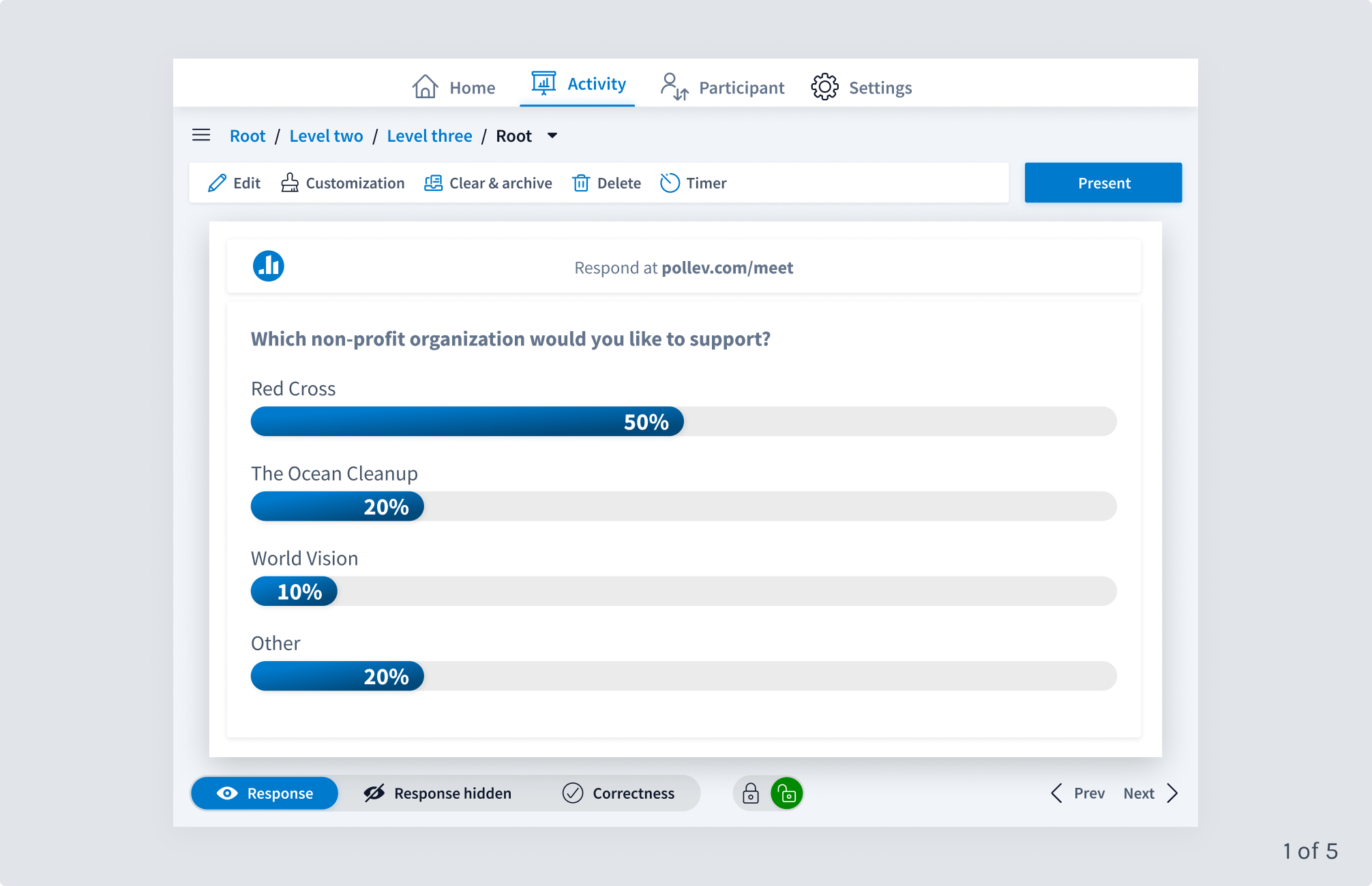
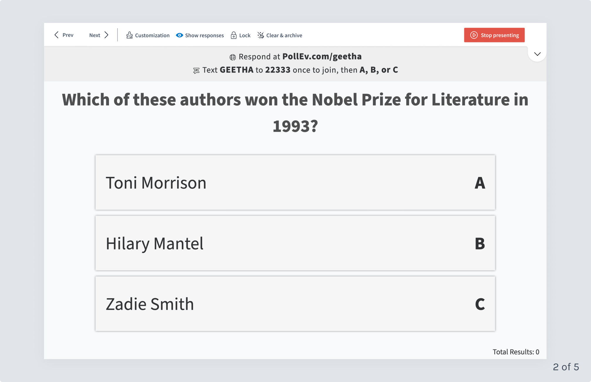
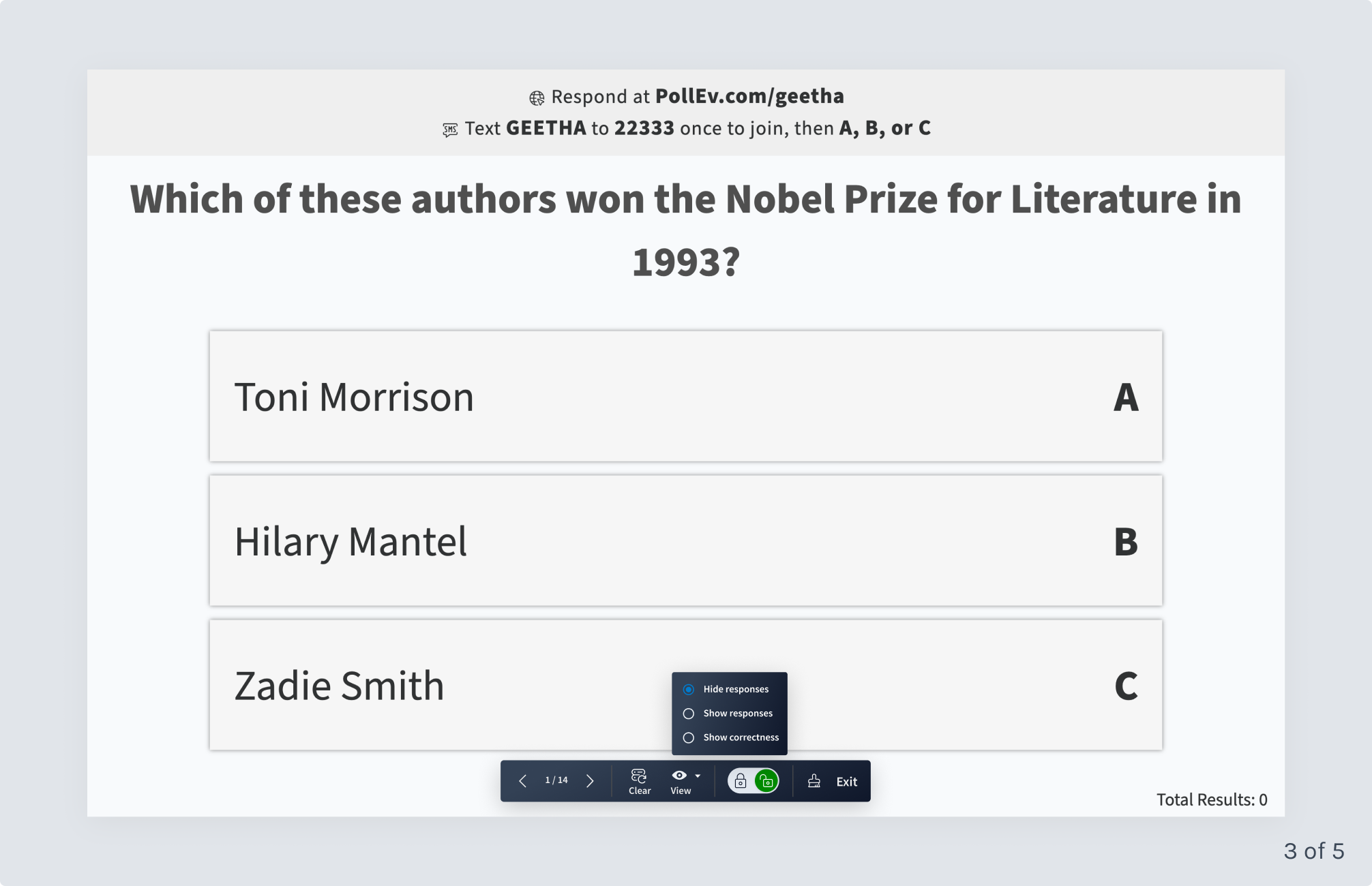
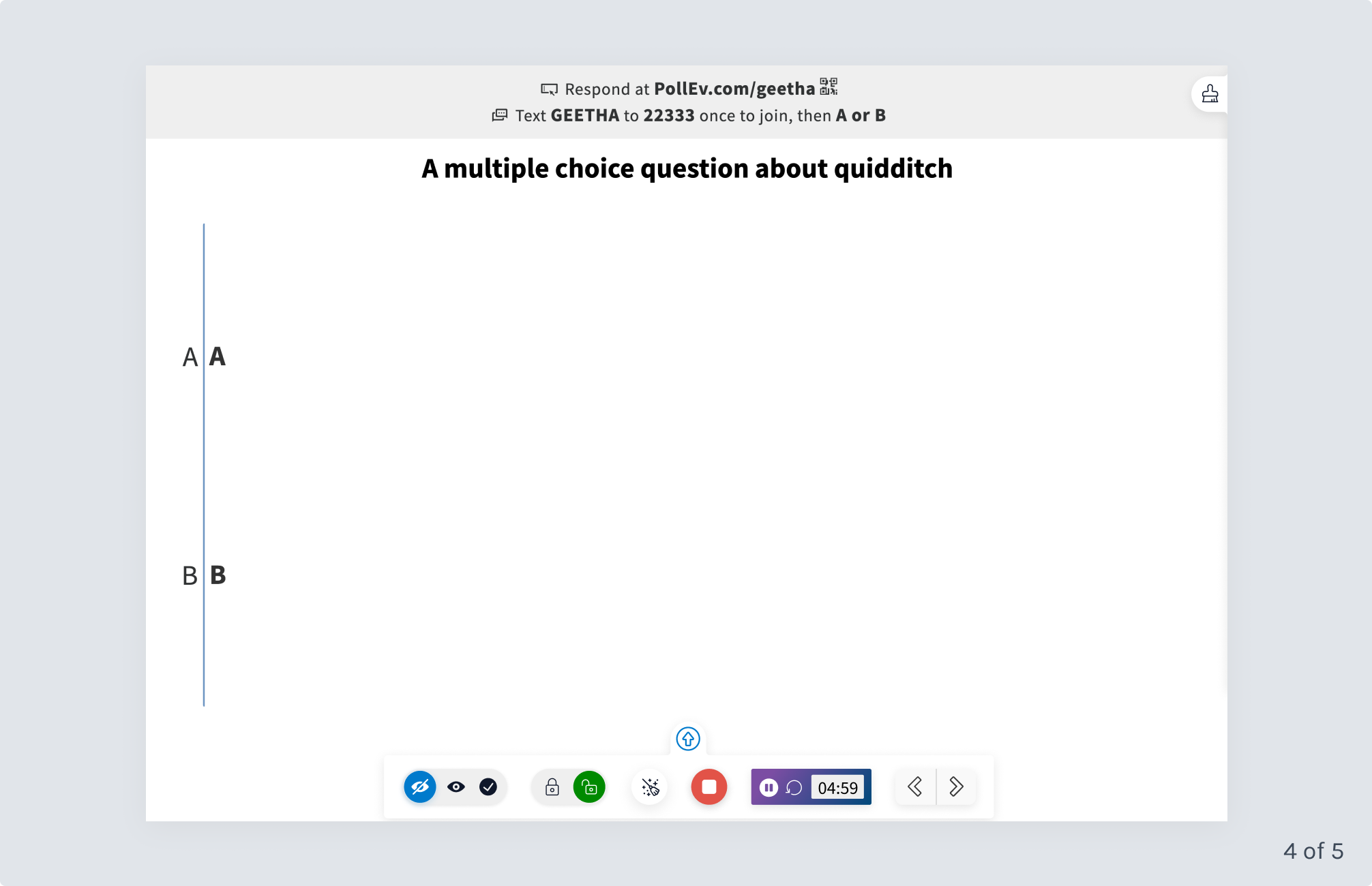
Poll Everywhere a profitable Y-Combinator startup, is a SaaS company that offers offers a live audience engagement tool that allows presenters to connect with their audience via polls, Q&A’s and other types of activities sharing live results immediately. A core part of the functionality are a controls that span across 2 screen that allows presenters to manage their polls and presentation. They can lock a poll so it no longer registers responses, navigate to other polls within a group and reset a poll by clearing all received responses. Importantly, presenters also use the controls to switch between different views of a poll. For example, they can choose when to simply show the poll question or show responses to the poll or even show correct answers if applicable.
This project involved redesigning and shipping Poll Everywhere’s the controls and feature layout across 2 connected screens.
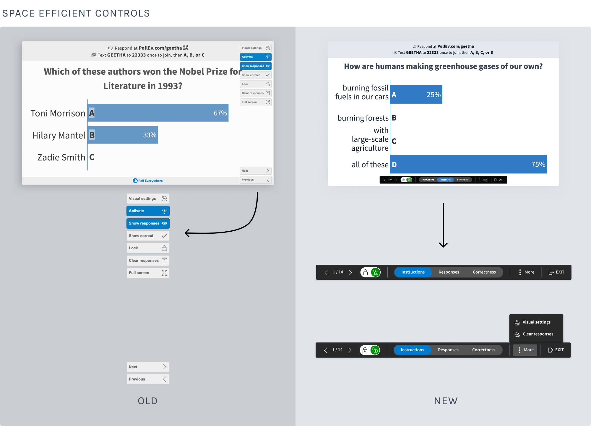
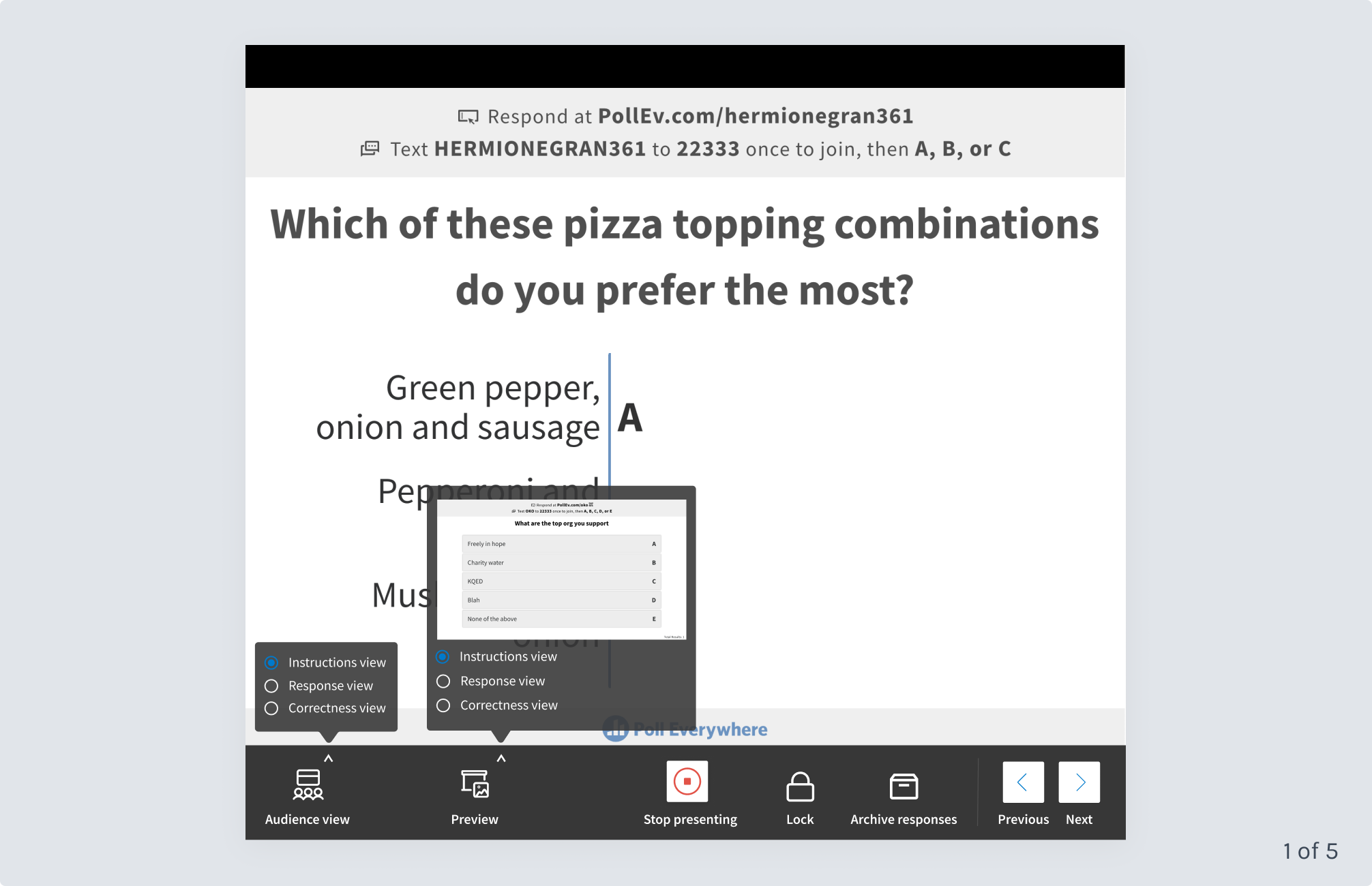
Based on years of customer conversations, we knew that our presentation controls were a problem. They were so large that they covered the live results chart - THE product - the core reason why customers use Poll Everywhere. When a presenter clicks on a slide to display the controls, they’re viewable by everyone who is participating. Covering the chart was not only an issue because it hindered people’s ability to clearly see live results, but also because it was our billboard - the feature that peaks audience members interest to look into our product when they see it being used.
Some items on the controls were confusing too. Customers would have questions like these:
Despite having the largest market share in the space, Poll Everywhere’s controls were dated-looking, which certainly didn’t help us when comparing our product to our more modern-looking competitors.
At Poll Everywhere, we work in small cross-functional teams with one product designer. I was the lead product designer on this project and responsible for end-to-end design to production. My work included competitive research and UX pattern research, design iteration, visual design, usability testing and QA once the new layout and controls were shipped.
My colleagues on this project were a senior product manager, a front-end architecture lead and a full-stack engineer.
The work you’ll see in this case study happened in phases over the course of a year (😅 - yes, you read that right). This project took place during the pandemic and we needed to allocate our small design and engineering team’s time to some other large-scale features we were building that year. In the end, some of the other features we built ended up nicely dovetailing with this project’s features, which made the final version much better.
Poll Everywhere offers live audience engagement software where audience members respond to activities on their mobile device or computer from the presenter’s URL and live results are displayed on the presenter’s screen. Here are some of the ways that Poll Everywhere is used:
Poll Everywhere is used in a variety of settings, with the majority being:
Customers include Google, Harvard, Mutual of Omaha and many others.
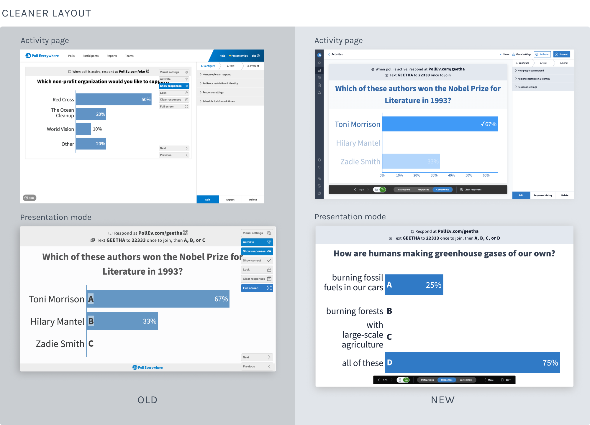
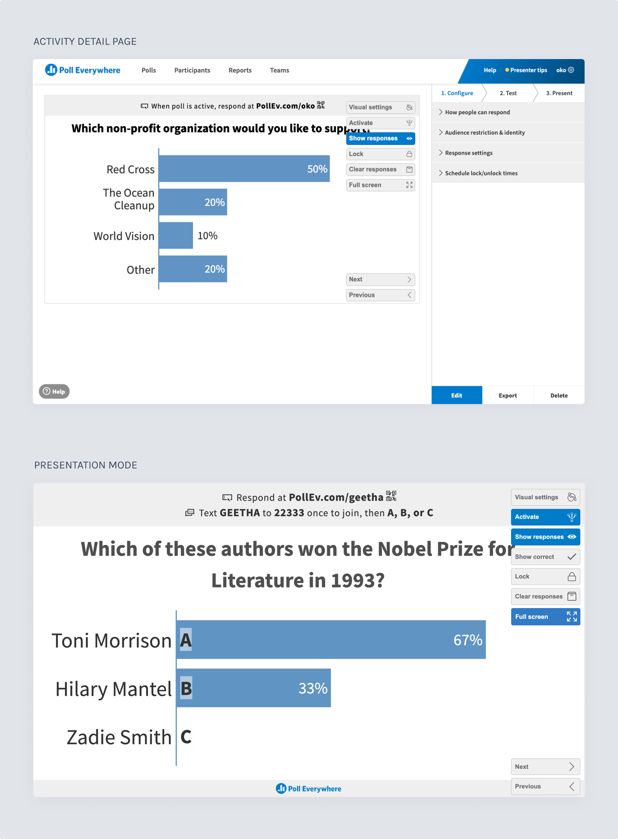
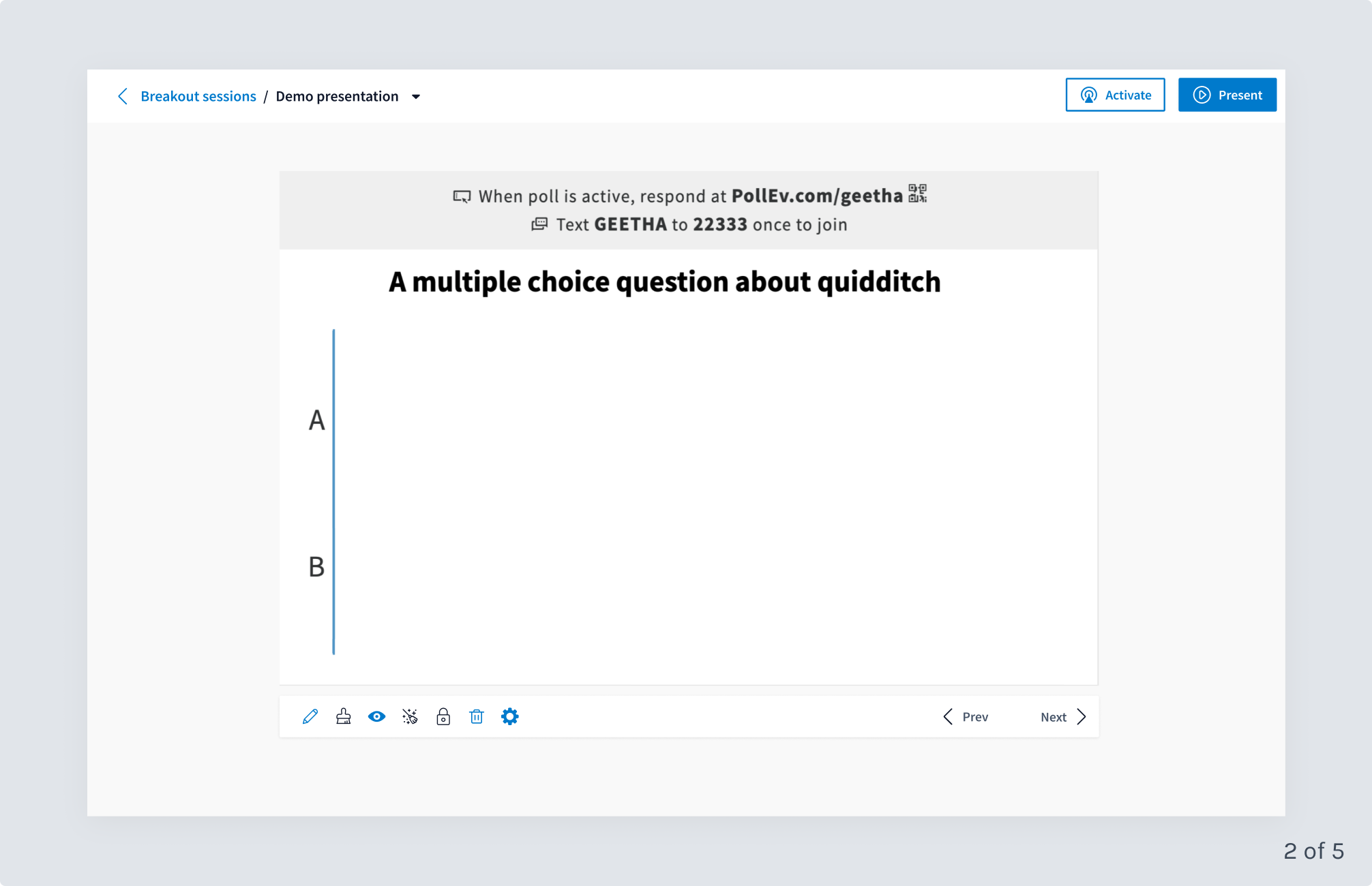
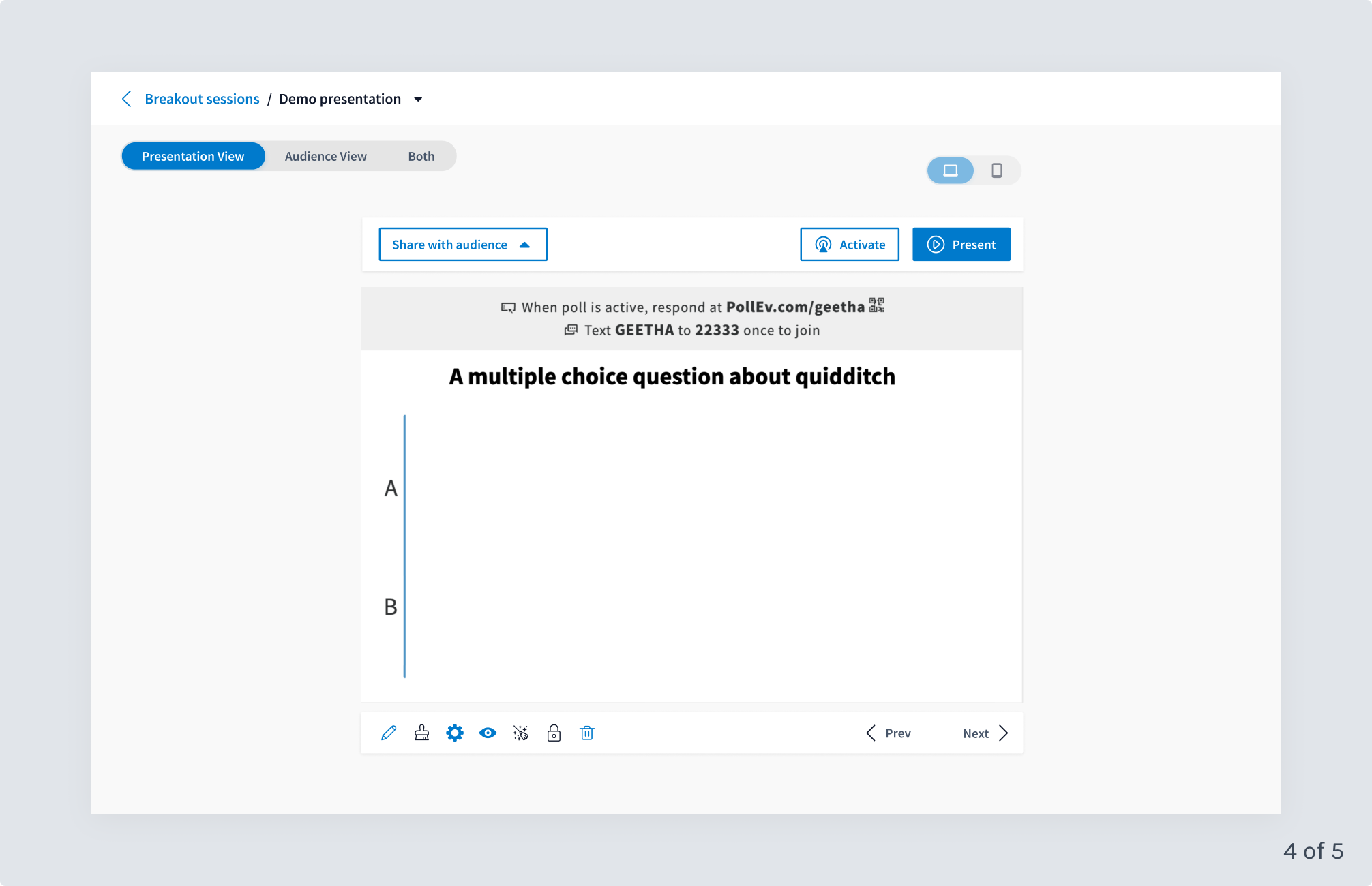
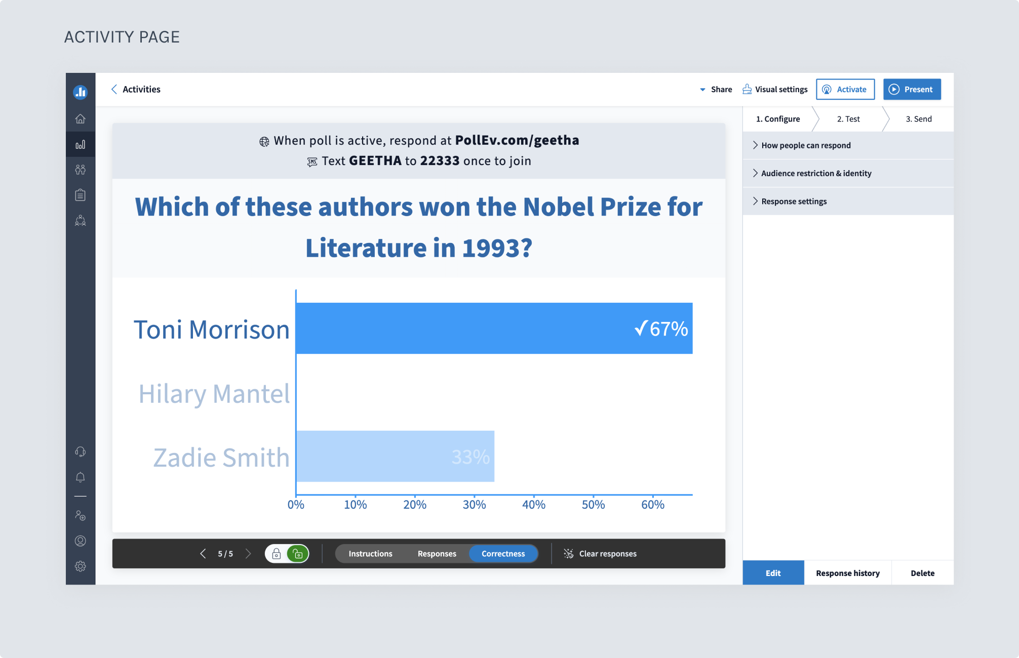
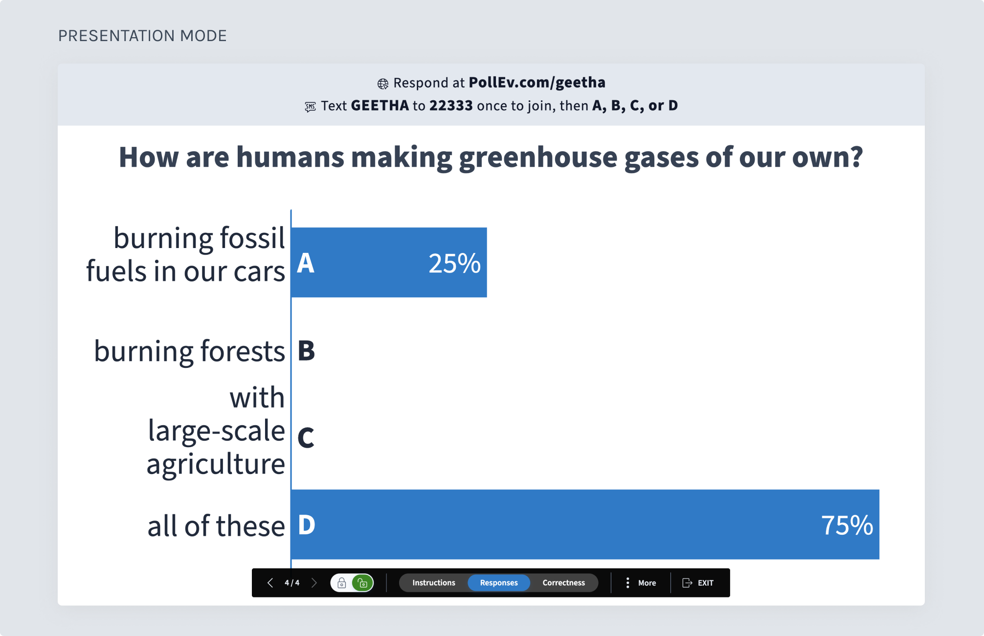
The presentation controls probably should be called “activity controls” because they are used across 2 connected screens:
Essentially, the activity page is the “off-stage” portion before a presentation and presentation mode is “on-stage” when a presenter is showing the activity to their audience.
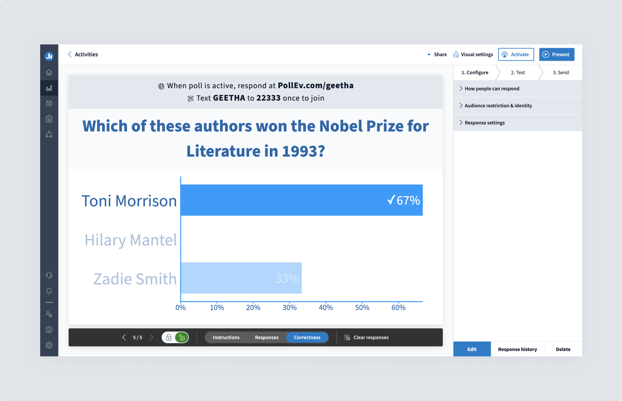
I call these 2 screens the “bread and butter” of Poll Everywhere’s product. The activity screen is where all the set-up parameters happen to create the magic on the live results screen. The live chart interaction is the product that customers sign up to use. (presentation mode).
Important note: the creation of an activity does not happen on the activity page. The activity page displays the activity once a user creates their question.
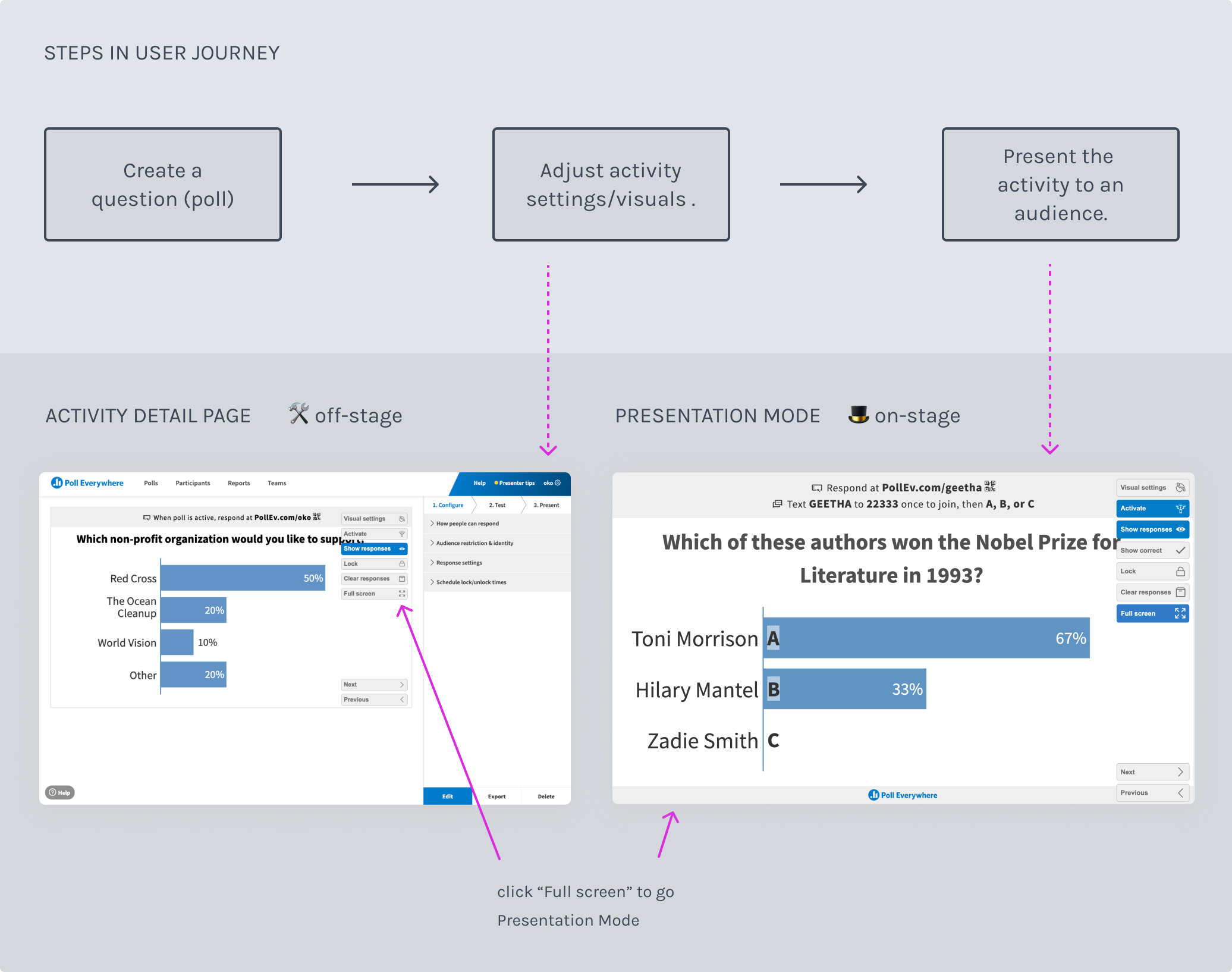
Since the controls cut across 2 screens, this project would involve redesigning parts of both the activity screen and the presentation screen.
Despite the desire to improve the user experience and make both pages more modern, several core portions were off-the-table:
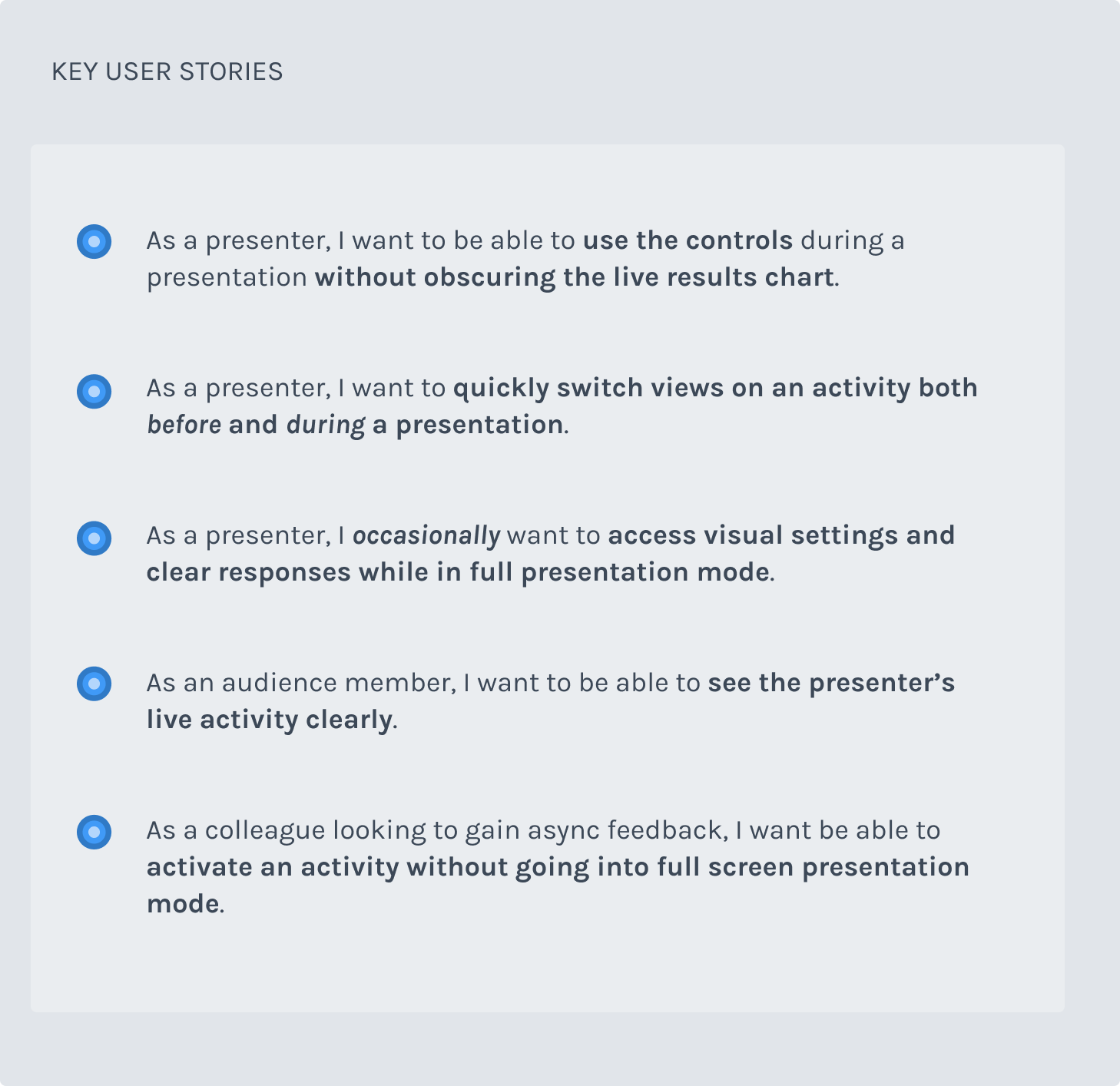
Due to these off-the-table sections, my key user stories ended up being the ones in the image below.
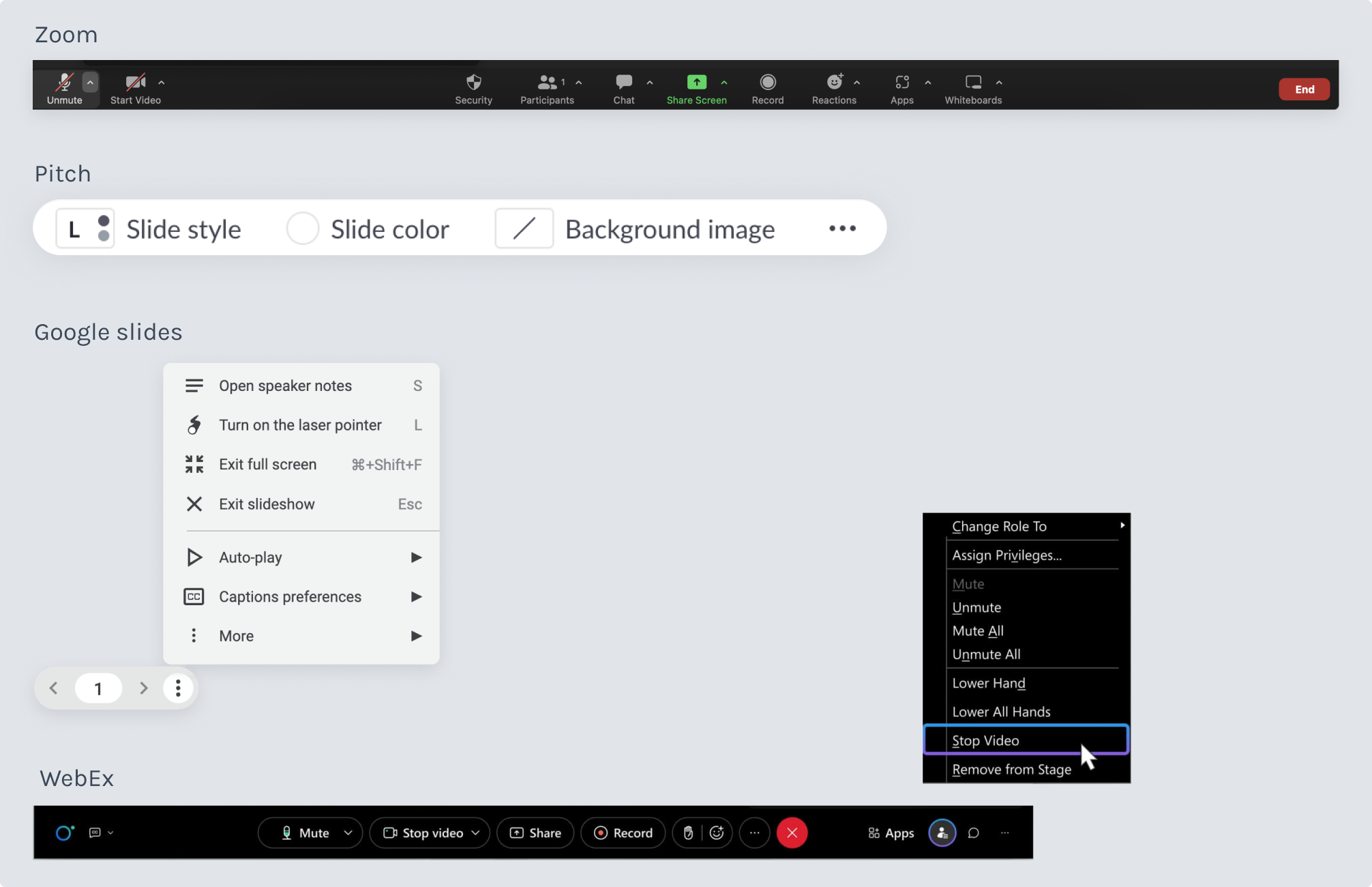
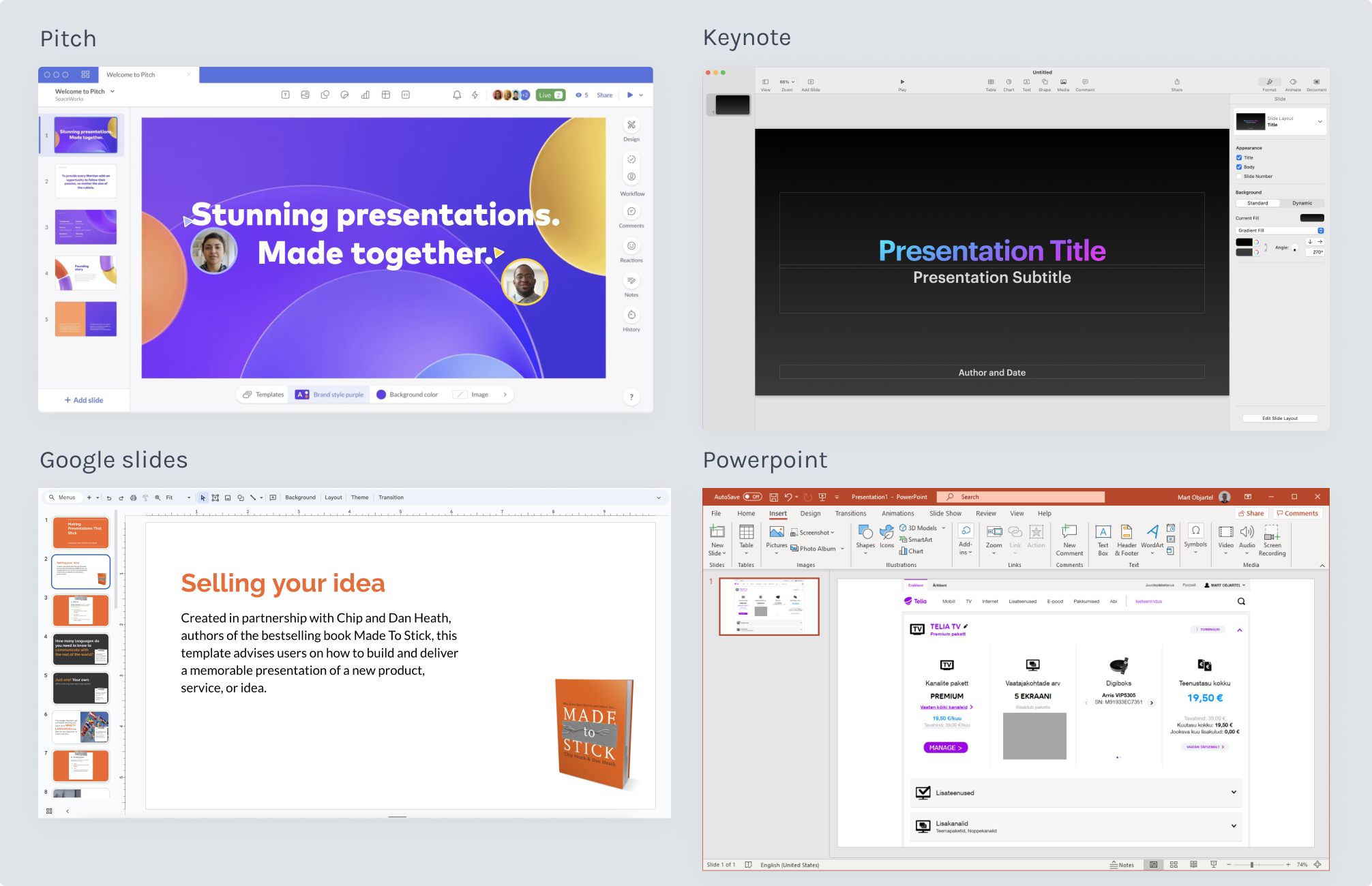
While I briefly looked at several products in the same product space, those did not end up being helpful because our product mental models were a little different. It was more fruitful to look at products like slideware that had a live presentation moment with an “off-stage” experience and “on-stage” experience - or live video conferencing software that had a set of controls for quick ease of use during a meeting or presentation.
I was researching these tools to see how they organized their layout and controls in a way that had great usability and were also fresh and streamlined.
As you’ll see in the design iteration many of the patterns from these products, like tool and controls organization influenced some of my design choices.
On the activity page:
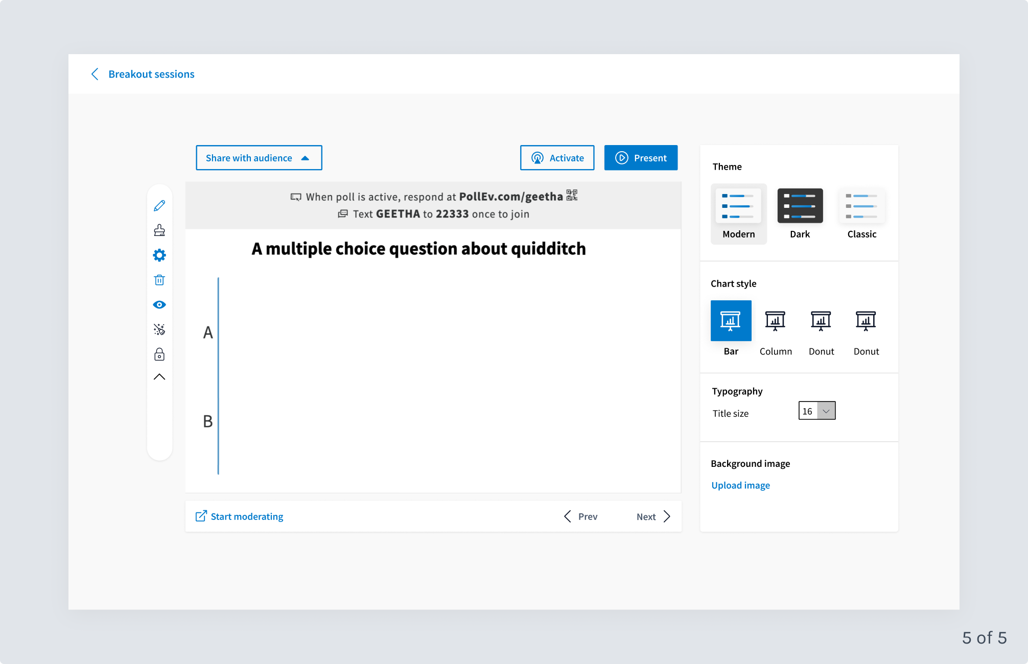
On both the activity page and in presentation mode, I explored:
Check out the slide sections below to see selected design explorations for the activity page and presentation mode.
Below I’m sharing key testing insights from what became 2 phases of this project. In reality - we ended up shipping the validated presentation controls behind a flag during the first 6-week project, worked on other projects, and then started the next 6-week project to work on the activity page layout and reconfiguration of key pieces of functionality.
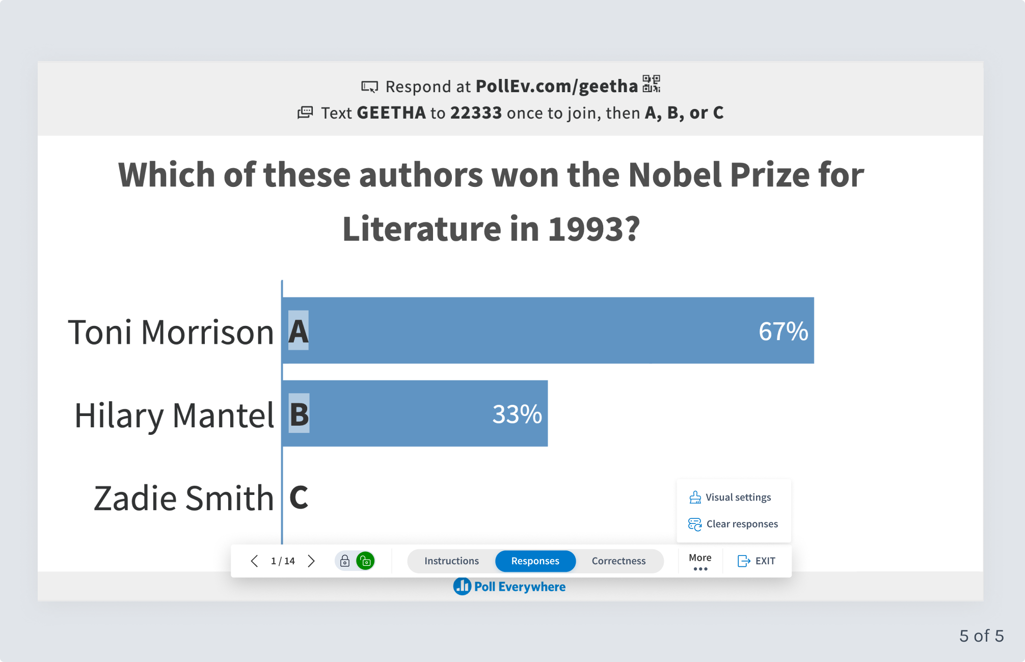
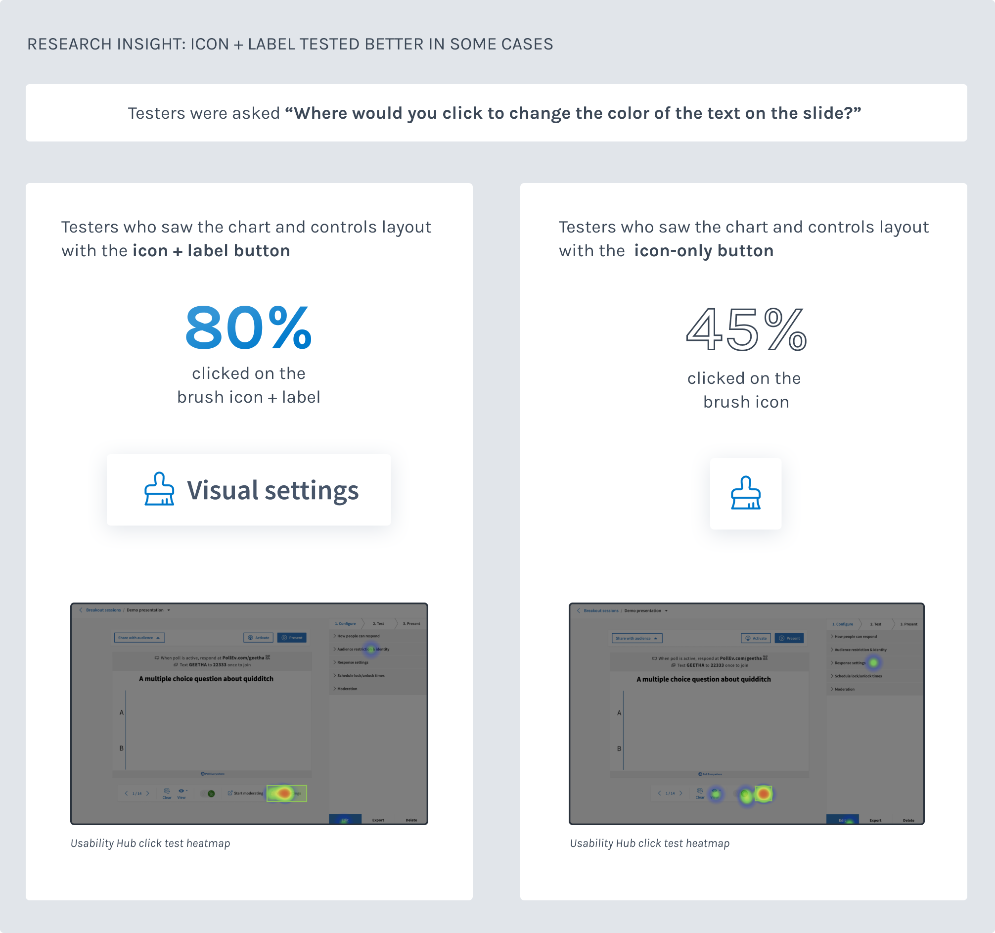
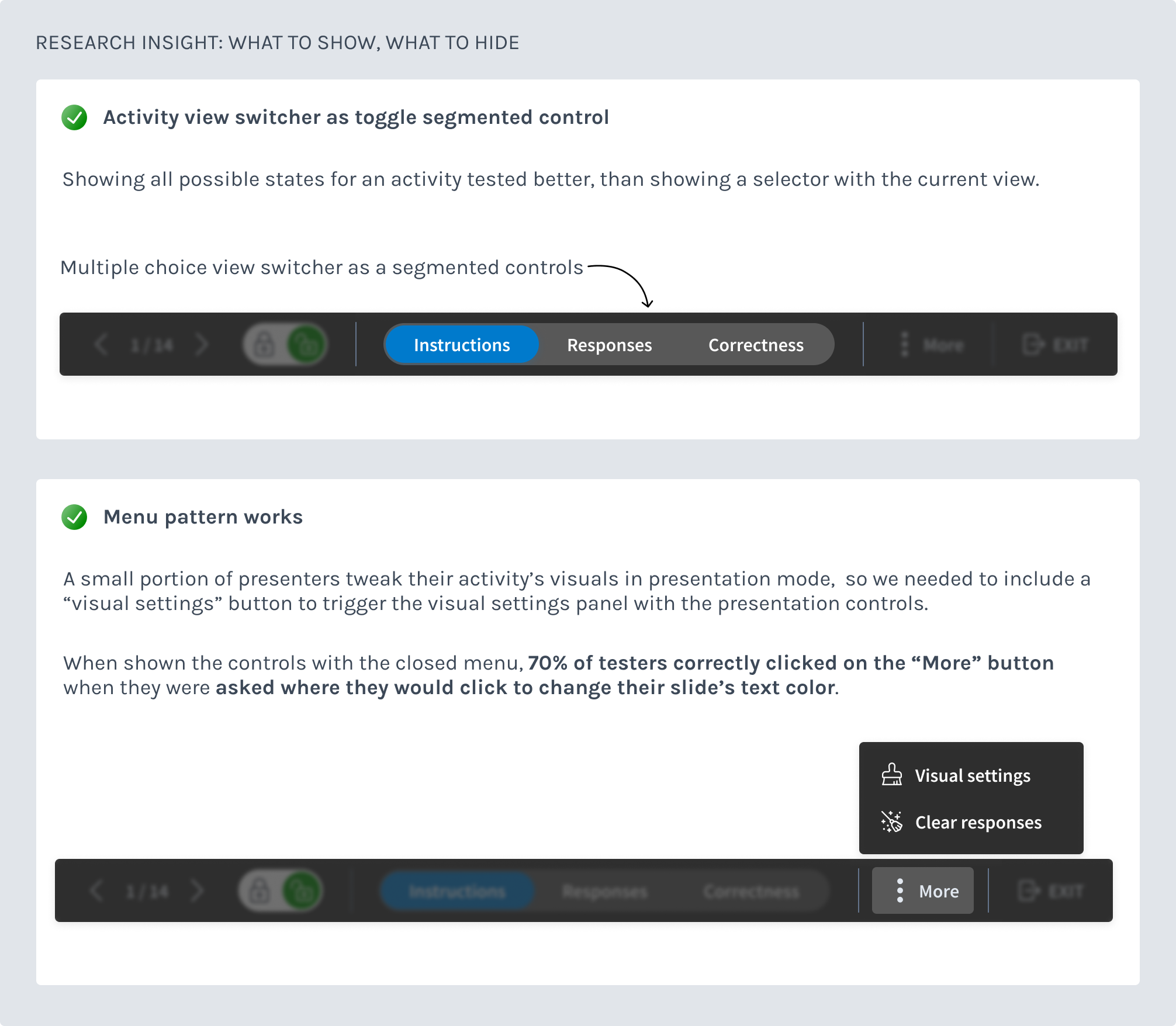
For user testing, I conducted more than 90+ tests using Usability Hub. I used click-tests to assess usability, comprehension, icons and UX language. I also used preference tests for visual items, like the color of the controls bar, icons etc.
In the images, below check out some of the main findings from user testing.
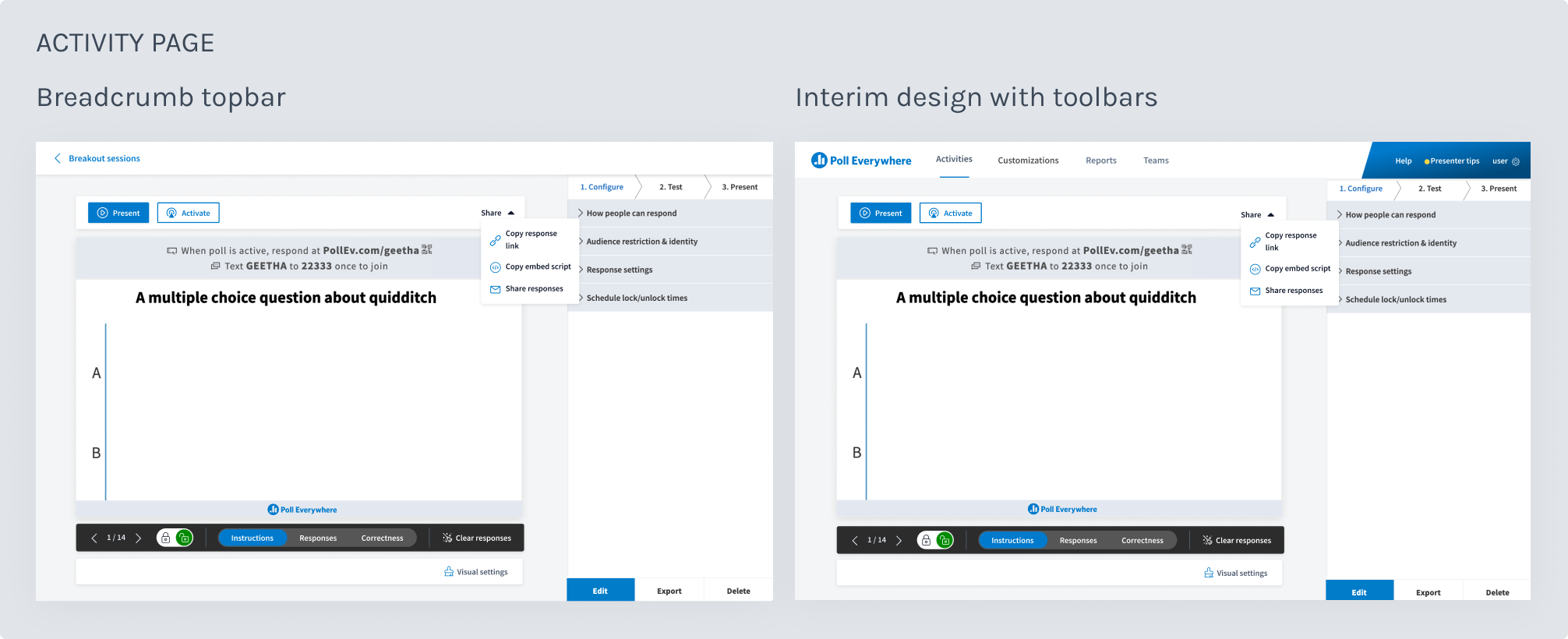
During the activity page and presentation controls project, I collaborated with a design colleague to create a folder system to help presenters organize all there activity questions. Breadcrumb navigation paired with folder management allowed presenters to navigate into a folder, select an activity and view it on the activity page, with the folder name listed in a breadcrumb on a bar at the top of the screen. This tested well and would serve as a good pattern for single-focused tasks across Poll Everywhere, like our reports feature.
The problem: The new folders feature, which was a huge amount of technical challenge, had only just begun. (It would also take a year to finish). So I couldn’t use the breadcrumb topbar pattern just yet. The other issue: our product nav was also horizontal bar on the top of the screen and my PM colleague had data that our customers would sometimes navigate away from the activity page to parts of the product. The single-focused task idea wouldn’t quite work yet unless we also had a way to still show parts of the product’s navigation. We ended up rebuilding the nav to a vertical navigation several months later and were able to incorporate the breadcrumb topbar. (See end case study).
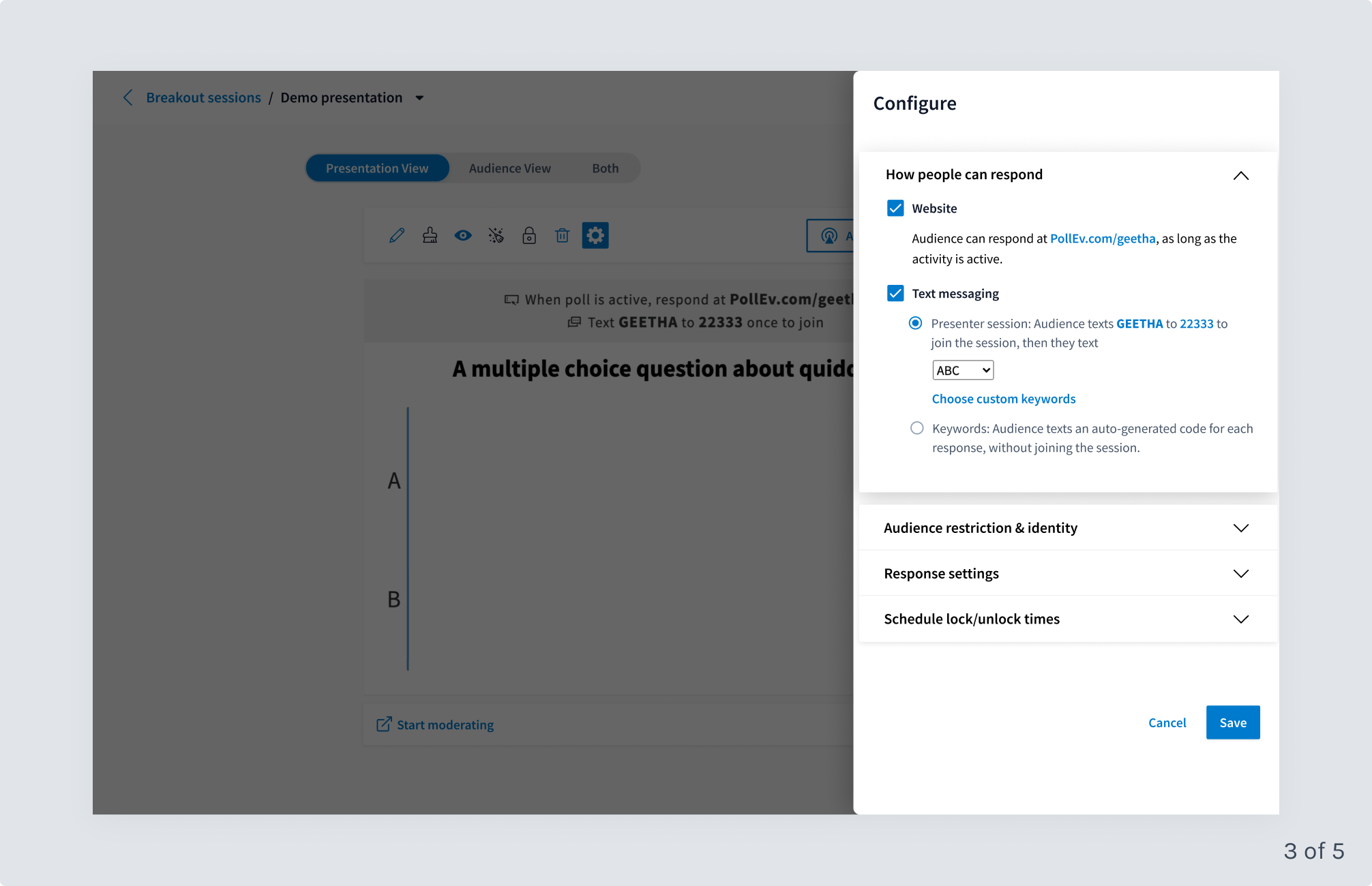
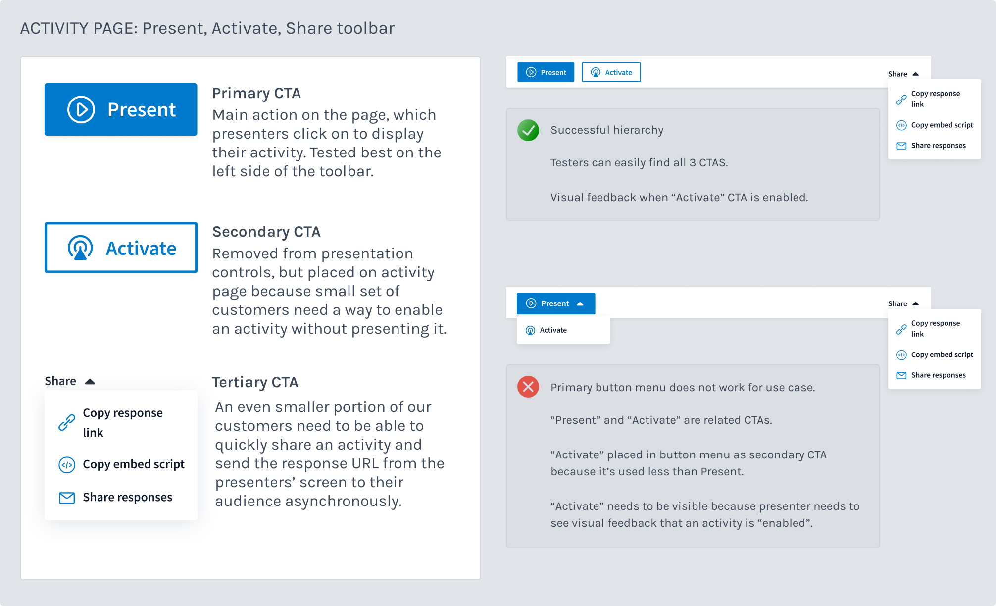
Interim solution: As part of our design system, we also designed new pattern of toolbars to house primary, secondary and tertiary actions. I tried these patterns out for the activity page, and ran this CTA pattern through many clickthrough tests on Usability Hub, which tests successfully. More on the actual CTAs in the next section below.
We shipped the controls for the activity page and presentation screen, as well as the updated activity page layout behind a flag. It so happened that we had 2 other major product changes coming - the folder system and new vertical navigation pattern. Our Head of Product was concerned to throw these new massive feature overhauls at customers in quick succession, so while our project shipped - it shipped behind a feature flag. A very small cohort of new customers saw the new UI, but we did not get any meaningful or helpful data to support any additional changes.
Shipping behind a flag ended up being a boon.
Luckily the topbar breadcrumb pattern finally got implemented via our new vertical navigation project. I did not work on implementation because I was working on completing major work on the folders project. The breadcrumb topbar created more room for our primary, tertiary and secondary buttons - Present, Activate and Share, an idea I explored in my initial design explorations. Visual settings also got a spot on the topbar where it tested well. The button pattern followed our new design system primary, secondary, tertiary pattern.
The CSAT scores from customers showed a 21% lift in terms of customer satisfaction with the new controls over the old controls.
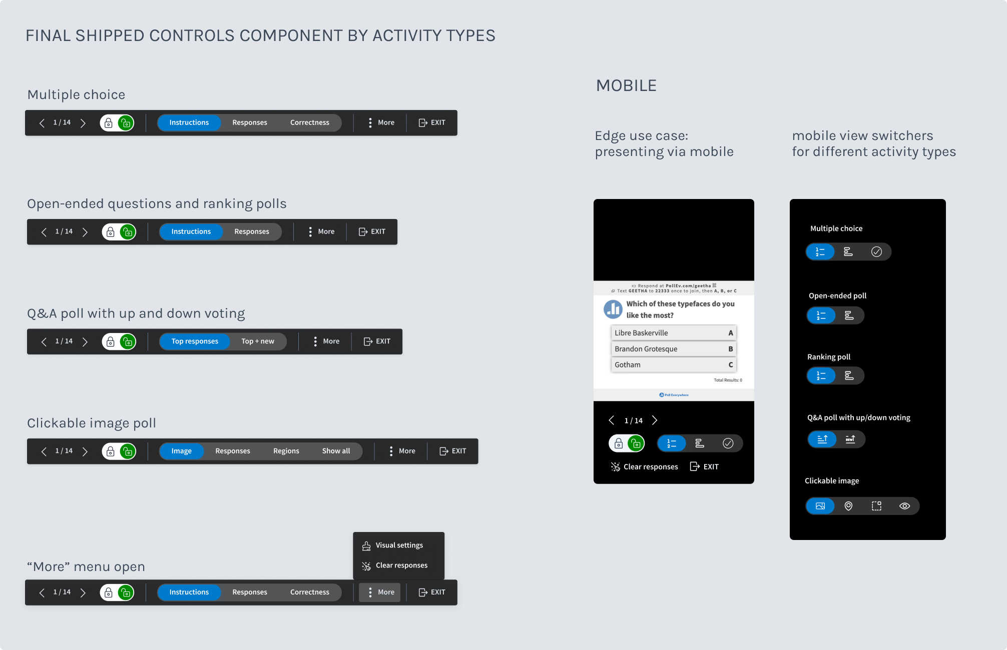
Below are the improvements that were shipped on the activity page and presentation page.